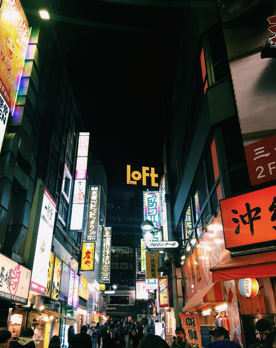
Tokyo 2018


Minolta snaps


For the love of letters!
18th August 2015
My interest in typography began during my A Level Graphic Design course during a food branding project. I hadn’t really explored hand lettering until my teacher suggested looking at the work of Erik Marinovich. The quality of his work had me in awe, I then started to manipulate my own work, seeing how much I could change the letters whilst still maintaining legibility. Below is the style I created, I was so pleased with the outcome.

During my Foundation course Typography took a back seat as I felt as that was the element of Graphics I had focused on during A level. For the first few projects on my Foundation I didn’t really produce many typographic pieces. It wasn’t until the penultimate project that I decided it was time for some Lettering! I started looking in to Graffiti as it became highly relevant to my project. I came across a post on Hype Beast about Towns, a London based Graffiti artist. Feeling inspired I started to produce Graffiti styled lettering for my project which was based on Gentrification.

 For my final Foundation project, “The Great Outdoors”, I started looking at 3D typography focusing on threading. I created a 3D piece on wood which I didn’t end up using, but was great fun to make!

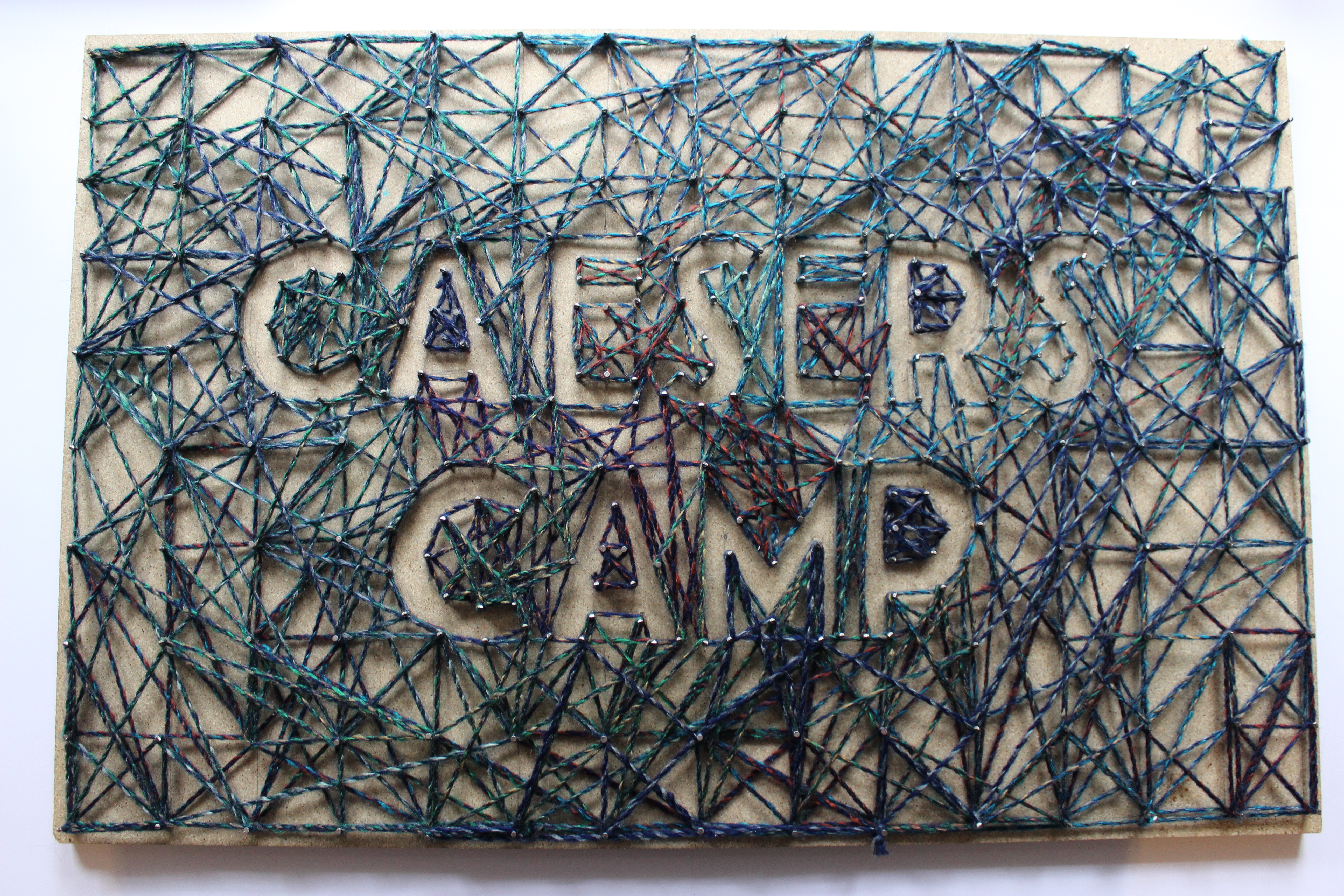
For the same project, I wanted to visualize the quote “Adventure is out there” to be used as part of the branding for a new Adventure Centre. I wanted to combine elements of traditional and modern ways of camping so I began looking into traditional/vintage designs. I was amazed when I came across David A Smiths work, especially the album cover he designed for John Mayer. The level of detail was just incredible and looked so traditional. Using similar techniques to Smith I produced the piece below after many hours of work.


